1. SwiftKey 3 Keyboard
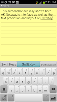
SwiftKey is one of the best keyboard replacements for Android. The keyboard spacing is better than the default S3 keyboard and the text prediction is one of the best you will find. The app will actually scan all your texts and email (with your permission of course) to find out what your commonly used words are. After that, autosuggestion of words becomes very intuitive. You'll be pleasantly surprised when work jargon, non-English words you commonly use, and even full hashtags are automatically suggested as you type.
Add to the spacing, it also has several color themes you can choose from. Since I use a white S3, I figured a clean white keyboard would look best with my phone.
2. AirDroid
Everyone connects their phones to their laptops. Even during the Nokia days, USB connectors were essential for transferring music, photos, and even sending texts through your computer.
AirDroid does all of that and more without a cable, via wifi, and through your internet browser.
This app connects your Android to your computer via your wifi network. Once you're connected, you can transfer files (straight to the folder you want), explore the contents of your phone, view and send text messages, and view other details of your phone.
The way the app connects your phone to your computer is pretty cool too. You first go to the AirDroid webpage where a unique QR code will be shown. Then, you open the app on your phone and use the camera to scan the QR code on the screen. A few seconds later and everything on your phone can be accessed through your browser. No typing of passwords or selecting networks/computers. Once your phone reads the QR code, it connects and you can access your phone through your browser.
There are also options to connect the two through passwords and unique URLs, but QR code scanning is the easiest and the coolest. For me, this is the best use of QR codes I've ever come across.
Connecting via your internet browser means that you don't have to download anything on your computer. As long as you have a browser (of course, it has to be updated) you can connect to your phone.
3. Dropbox
If you want to treat your phone as another drive on your computer, dragging and dropping or copy-pasting files from Explorer/Finder folders to your phone, DropBox is the best solution for you.
You have to download an application on your computer and your phone individually and set it up, but once it's done, sharing ANY file between your phone and computer is extremely easy.
A real life example: I took a screenshot on my phone which I want to include in this post. After I took the screenshot, I went to gallery and selected share to Dropbox. Now, I just browse through the files on my computer, go to to the Dropbox "drive", and then select the photo. Easy.
Additionally, Dropbox has the option to automatically save the photos you take on your phone onto Dropbox. This ensures that all your photos have a backup copy and makes it easy to view them from any web device.
Actually if you have a Google+ account, your Android phone will automatically backup your pictures to your Picasa as well. What, you don't have a Picasa account? If you have a Google account, you do.
4. The Social Network Bundle: Facebook / Twitter / Instagram
I don't think I need to explain this one. Also of note are Pinterest, Tumblr, Google+, and foursquare. If you're on these social networks, then always be on.
I'll talk about aggregators in another post. Also, see Flipboard below.
5. The Google Bundle: Google Gesture Search / Gmail / Google Drive / Google Goggles / Google Translate
For me, Google Gesture Search is the simplest and smartest launcher available.
The app will index all your apps, contacts, and music. Once the app is open, use your fingers to write individual letters anywhere on the screen. The app will then search your phone and display a list of what it thinks you want to open. Whatever you want to open on your phone is just a click and a few letter swipes away.
Gesture Search will also figure out which apps, contacts, or music you access the most. So the next time you write a C, the Calculator app automatically leaps to the top of the list.
Bonus: Another app, Gesture Search Bar, allows you to open Gesture Search through the notifications (swipe down) screen.
 If you use Google Drive (formerly known as Google Docs) get the app for easier access. Google Docs used to be a free online "Microsoft Office" where people can simultaneously edit a document. It still functions as such, but now has additional features.
Earlier this year, Google decided to revamp Google Docs and turned it into Google Drive. The change of name is because Google wanted to do what Dropbox is doing. Essentially, Google Drive functions exactly like Dropbox, as free cloud storage.
The main reason I use Dropbox over Google Drive is because I have 50 GB in Dropbox that I gained through referrals. My Google Drive only has 5GB of free space.
I however still use Google Drive because I have a lot of spreadsheets and documents in Drive/Docs that I work on.
Google Goggles is an amusing little app. If you want to talk about practicability, it functions as a QR code reader (3D barcode reader).
Aside from that, it recognizes logos, foreign language characters, and popular pictures and tells you what the images are. It can integrate itself into your camera so it will automatically scan whatever you take pictures of and tell you what you're shooting.
Google's mission with this app: you can already search by typing text and using your voice, Goggles lets you search through your camera.
Okay, this app is not really "essential" but Google Translate has a pretty cool trick: it can translate actual foreign speech into text. Have someone say something in another language into the app and it translates the language for you on your phone. You can then type in your response in English and the app will read the translated text to the person you're talking to in the foreign language.
It also does what Goggles does, translating text you take through your camera into English (or whatever language you like). So if there are Japanese characters on the biscuit you're eating and you want to know what it means, open the app and it will magically translate it for you.
Not exactly apps, Google Calendar and Google Contacts should be integrated into your phone already. Make sure your accounts are connected for cloud backup, anytime access from any web device, and hassle free phone upgrading.
Also, your built in photo gallery can also be linked with Picasaweb. If you have Picasa on your computer, syncing between your computer, phone, and the cloud is super easy. On your desktop, you can select albums in Picasa you want to sync to the web and it gets synced. What is on the web will also appear on your phone if your connection is always on.
Oh, the perks of being on Google.
6. SMS alternatives: Go SMS Pro or Handcent
I pick between the two for aesthetic reasons. I originally used Handcent but I switched to Go SMS Prop because I liked the iPhone-like messaging layout (I came from an iphone) and subdued color scheme.
Both apps are powerpacked with features but one of the best features available in both is the ability to schedule text messages. If you want to be the first to greet your friend a happy birthday, but you're already sleepy, you can create your message at 7pm and tell the app to send it at 12am.
If you know other people who use the same app, you can also both create an account and send free texts through the internet. There are a lot of internet messaging services out there, but since this is integrated into your main SMS app, sending internet messages becomes less cumbersome.
A unique feature of Handcent is the ability to delay text messages. Once you hit send, it waits a few seconds before it actually sends the message. Why do that? Just in case you realize that you sent your text to the wrong person or that autocorrect picked the wrong word, you still have time to hit cancel and avoid that embarrassing text.
7. *updated* If you've been here before, please don't download Double Twist. It doesn't sync playcounts back to iTunes, it only syncs it to the Double Twist desktop. They have lots of hooks for upgrades and I'm frankly not happy. I apologize for endorsing them earlier.
I am currently on the hunt for the best music players and syncers.
For sure, iSync really syncs back playcounts to iTunes. The interface however is crude and there are connection issues with newer phones.
So, the search still continues. If you have any ideas, please hit up the comments.
8. Flipboard
Quite simply, Flipboard is the prettiest way to view online content on your tablet. It excels in converting your Facebook and Twitter feed into a flippable magazine complete with automatically loaded pictures, article text, and varying layouts.
Great for tablets, pretty good for phones.
9. The always on communicator bundle: WhatsApp + Viber
If your contacts have unlimited mobile internet or if you need to communicate with people from across the world, Whats App will give you free text messaging and Viber will give you free voice calls.
The best feature for both is each app's ability to scan your contact list and tell you who among your contacts are also using WhatsApp/Viber.
In reality, Viber also has messaging features, but I find that more people are on WhatsApp.
I would have added Facebook Messenger to this list, but the existing Facebook app already incorporates the features of Facebook Messenger. If someone sends you a direct message in FB, your phone will already prompt you with a notification if you're always on and have the official FB app.
 10. The Note Bundle: Any.Do + AK Notepad
The prettiest and most straightforward to-do list for Android must be Any.Do. It has a clean and minimalist interface & widget selection. It can sync with your Chrome browser on your computer so you can view your to-dos or add additional tasks from your browser.
There are a lot of notepad apps out there but (especially if you're coming form an iPhone) AK Notepad looks the most like a notepad.
Both Any.Do and AK Notepad also backup your data in the cloud. At this day and age, backing up your phone's data should really be automatic.
There are still a lot of great Android apps out there, but more on those some other time. If you're new to the Android community, these apps should maximize your connectivity and productivity already.
Enjoy!


